Proposing a symbol to stand for “Electric (Vehicle) Charging Station” to be used internationally on road signs and other signage. Multiple criteria fulfilled safeguard an enhanced performance of the symbol to support the sensorial and cognitive requirements of drivers in today’s demanding road environment. To facilitate distribution and use, the symbol (TS0460) is available here.

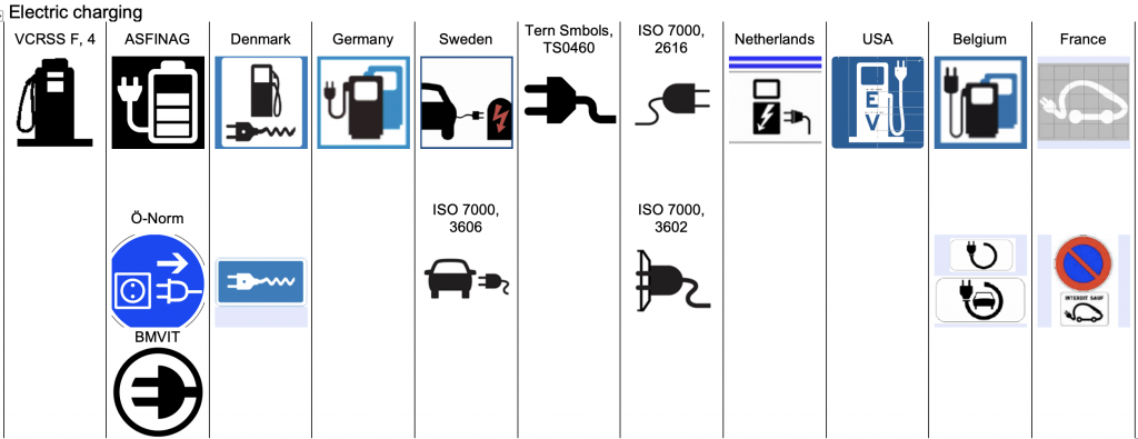
According to my research, solutions for a symbol to represent an Electric (Vehicle) Charging Station on road signs (or other signage) can not be considered to be harmonised, as the following picture of a compilation from several countries shows.

For some part, this may be due to the fact that, although countries follow the system of the 1968 Vienna Convention¹ on Road Signs and Signals, differences in interpretations on detail level require for different solutions.
Never the less, due to the current and intensifying rollout of charging stations, it is high time that harmonisation on international level takes place. We like (and need!) to easily find stations whatever country we travel to with our electric vehicles. Therefore, the symbol we look for should be the same everywhere, and it should be made in a way to support our sensorial and cognitive requirements according to the highest currently possible state of the art in Information Design. To achieve this, the following criteria where adhered to in the making of the symbol proposal:
Criterion 1: Research
Accumulation of graphical components of identical or related meaning and appearance from national and international resources (documented) in order to identify graphical figures with highest potential for being understood (comprehended) to be used in the symbol. The selection of components (graphical figures) follows the criteria of
- the degree of publicity, from which the comprehension level may be judged
- actual comprehension rate, determined by test procedures such as used for symbols of ISO 7001, using test method ISO 9186, or figures from the IIID Safety Symbols System.
“Actual comprehension rate” is usually preferred to “degree of publicity”.
Criterion 2: Graphical development
- MOA Design Method
The MOA Design Method improves long visual distance discrimination of visual information and makes the Contrast-Transfer-Function calculable - Retroreflection, irradiation and inversion
Considering the visual expansion of light (white) components compared to dark (black) components - Gestalt psychology
Consideration of rules such as e.g. “law of proximity” etc. Gestalt Psychology - Format performance
Safeguarding that highest possible performance of the Contrast-Transfer-Function (long visual distance discrimination) of the symbol when used in the following shapes: square, rectangle, equilateral triangle, circle. - System conformity
The graphical appearance of graphical figures is required to “fit” into aspired graphical systems used for signalisation to allow for combinability with earlier established figures (to fend off uncontrolled growth of the system). - Dynamic iconography
In case figures or symbols could be used to signify warnings, as on danger warning signs, figures should portray erratic, dynamic movement. This raises attention and reduces the response time of drivers. Dynamic iconography
¹ United Nations, Economic Commission for Europe, Inland Transport Committee. (1968/1995). Convention on Road Signs and Signals, done at Vienna on 8 November 1968
Pingback: Electric (Vehicle) Charging Station – Symbol Proposal | Stefan Egger